This tutorial assumes you have cloned and set up an application using Sealious Playground. If you haven’t done so already, follow the steps at (How to set up a new Sealious app using sealious-playground).
Creating the files
While the application is running in dev mode using npm run dev, open a new terminal and run the following command:
npx sealgen add-component
The command will prompt you for the name of the component:
$ npx sealgen add-component
What's the name of the component?  > my awesome component
Type your name (you don’t have to match the case and you can use spaces if you want to, it will be automatically converted to a code-safe version) and press Enter.
If everything goes well, you will see the paths to newly created .css and .tsx files:
Created ~/projects/sealcode/sealious-playground/src/back/jdd-components/my-awesome-component/my-awesome-component.jdd.tsx
Created ~/projects/sealcode/sealious-playground/src/back/jdd-components/my-awesome-component/my-awesome-component.css
Visit the .tsx file in your IDE and notice the two crucial sections of it.
The arguments
The component_arguments object describes the type and shape of arguments that this component will receive. It will be used to create a GUI for editing this components, as well as for creating TypeScript types for the input to the toHTML function.
const component_arguments = {
	title: new ComponentArguments.ShortText(),
	content: new ComponentArguments.Markdown(),
} as const;
We see two arguments here - one named title that is a ShortText argument (meant for small text pieces within the component that cannot convey any structure or styling), and another called content that contains Markdown (which can be rendered to HTML for more control over its structure).
You can freely change the names and types of the arguments. You can even create more complex using the Structured and List argument types (described in a further section of this tutorial). When in doubt, inspect the ComponentArguments object in your IDE to see all available component argument types.
The toHTML function
Below we see another important part - the toHTML function. This is a function that takes parameters specified by the user (in a shape that matches the arguments in component_arguments object).
	toHTML(
		{
			title,
			content,
		}: ExtractStructuredComponentArgumentsValues<typeof component_arguments>,
		{ render_markdown }: JDDContext
	): FlatTemplatable {
		return (
			<div class="my-awesome-component">
				<h2>{title} • MyAwesomeComponent </h2>
				<div>{render_markdown(content)}</div>
			</div>
		);
	}
By default we’re using the JSX syntax to create the output. It basically translates 1-to-1 with the resulting HTML, and uses {} to interpolate JS variables within this HTML.
Viewing the component
To view the component, open your app and navigate to /components:
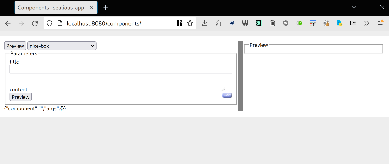
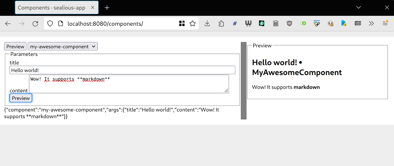
You can now pick your new component from the list at the top. You’ll se the left column fill with inputs that let you change values for the arguments of the component, and on the right you can see the rendered output of that component with those arguments filled in.
You can even resize the preview to get a feel of how your component looks like on different container widths:
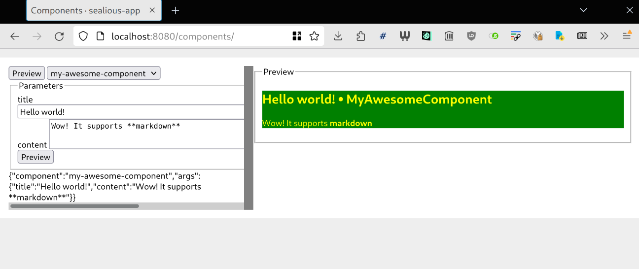
Changing the style
Open the .css file that sits right next to your .tsx file and add some styles to your component:
.my-awesome-component {
   color: yellow;
   background-color: green;
}
The styles in the browsers should automatically refresh and reflect your changes once you save the .css file.
Complex arguments
Try adding a List argument type in the tsx file, like so:
const component_arguments = {
	title: new ComponentArguments.ShortText(),
	content: new ComponentArguments.Markdown(),
	dogs: new ComponentArguments.List(new ComponentArguments.ShortText()),
} as const;
you can now add a dogs attribute to the .toHTML function and use it within its body
	toHTML(
		{
			title,
			content,
			dogs,
		}: ExtractStructuredComponentArgumentsValues<typeof component_arguments>,
		{ render_markdown }: JDDContext
	): FlatTemplatable {
		return (
			<div class="my-awesome-component">
				<h2>{title} • MyAwesomeComponent </h2>
				<div>{render_markdown(content)}</div>
				<h3>Dogs:</h3>
				<ul>
					{dogs.map((dog) => (
						<li>🐕{dog}</li>
					))}
				</ul>
			</div>
		);
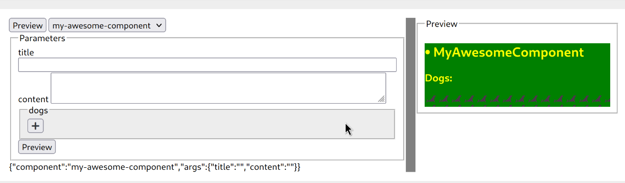
Press Preview and the interface will refresh with a list editing GUI:
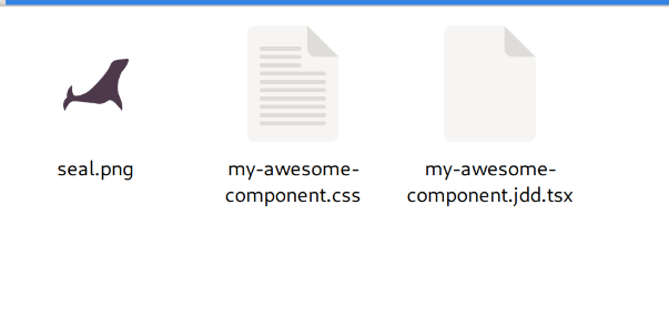
Adding assets needed for CSS
When you want to add a small image or a font that will be used in the CSS, add the file next to your component:
Then, simply use it in url() within CSS:
.my-awesome-component {
   color: yellow;
    background-color: green;

    &:after {
	content: " ";
	height: 20px;
	width: 100%;
	background-image: url("./seal.png");
	display: block;
    }
}
Beautiful.
Colors
To maintain color shades consistency in JDD components, refer to Working with colors in sealious-playground / sealgen