Starting from sealgen@0.17.11, you can now generate color palettes based on a few predefined colors:
Here are the main points:
-
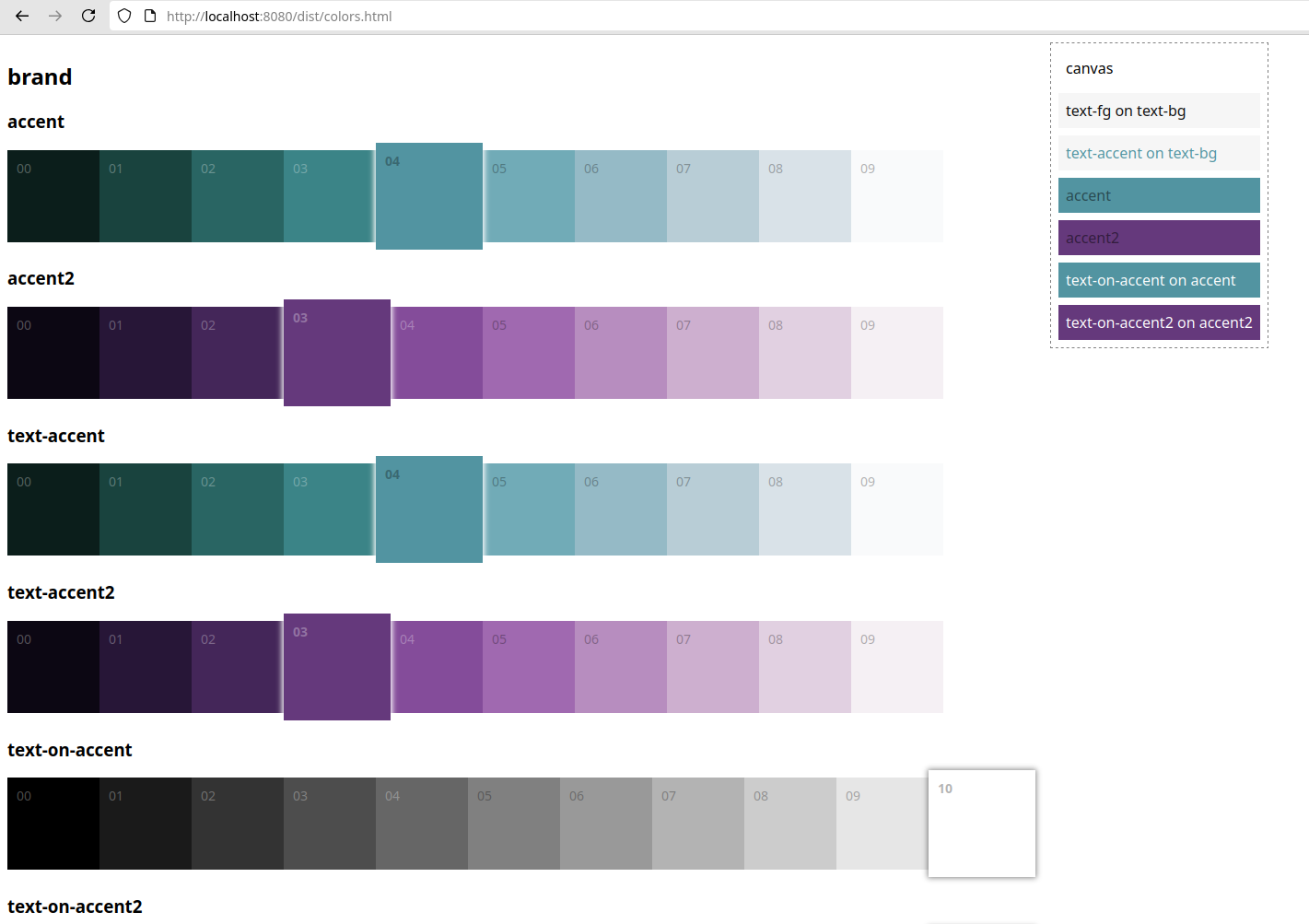
10 shades are defined for each color.
-
the main colors are defined in
src/back/colors.tsfile -
the built-in colors’ values can be changed, but their names are important, as they are used across the built-in components, so it’s best not to change the names of already built-in colors. You can however add as many new colors as you like;
-
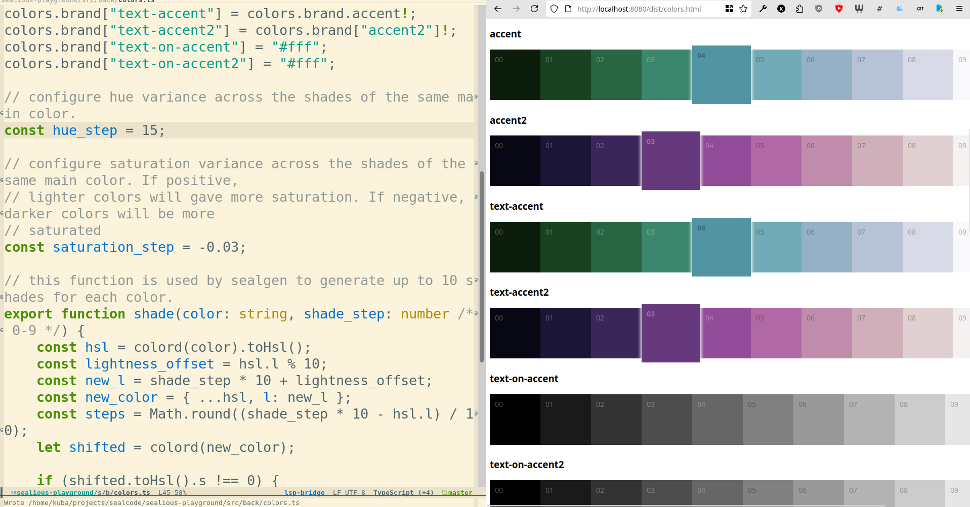
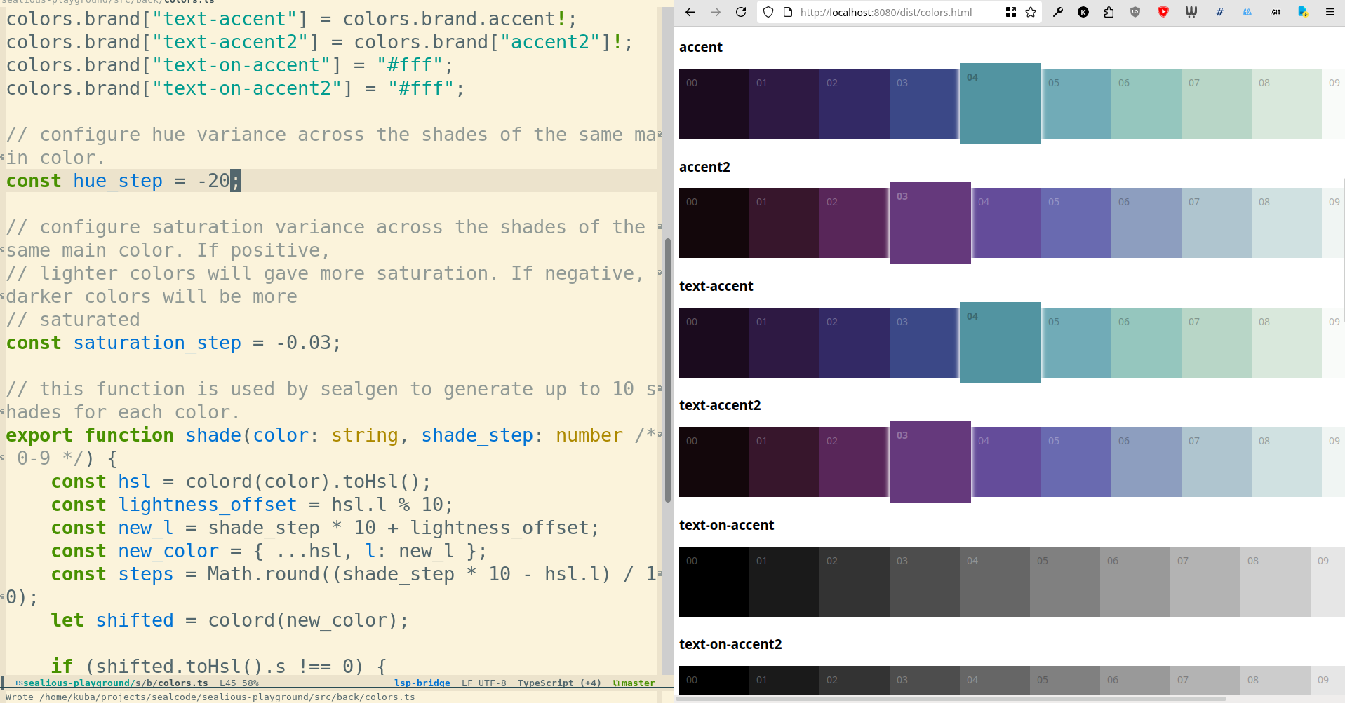
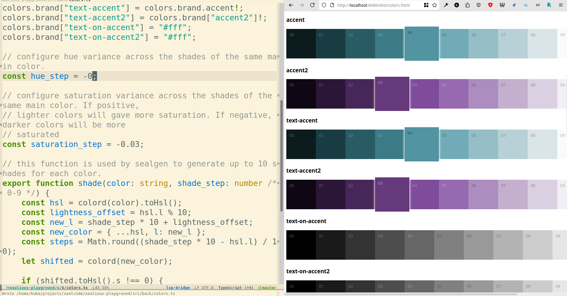
you can configure how the 10 shades are generated by adjusting the
hue_stepandsaturation_stepconsts incolors.ts:
-
You can see the color palette by running
npm run watchand visitinglocalhost:8080/dist/colors.html; -
Clicking the color in the palette will copy it’s css variable name;
-
Clicking the pairing in the canvas section will copy both colors’ css variable names;
-
The color palette view automatically refreshes as you make changes to the
colors.tsfile, so you can easily create a live preview of the result of changes you’re making;
How to pick the right colors
The components across JDD are designed in a way that assumes there’s good contrast between certain colors. Pay close attention to the pairings shown in the canvas:
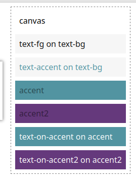
Make sure that all rectangles with descriptions starting with “text-on” are nice and legible.
How are colors named
canvasis the main background of the entire pagetext-bgis text background for longer paragraphs:text-fgis text color for longer paragraphs. Usually paired with text-bgaccentis an accent color used for buttons, icons etcaccent2is an alternative accent color, used on secondary elementstext-accentdescribes what color should the text be when accenting it with color. Usually the same as theaccentcolor, but you might choose a different shade so it looks better ontext-bg.text-accent2is same as above, but based on the second accent colortext-on-accent- what color text should be when put on a background colored with accent colortext-on-accent2- what color text should be when put on a background colored with accent2 color
How to use colors while writing components
When writing components, use pairings mentioned in the canvas section whenever possible.
If not necessary, don’t use shaded versions of colors, but the main colors (the ones that are emphasized in each row of the palette) instead.
If choosing color pairings for text+background outside of the ones described in the canvas, use shades that will surely give a nice contrast, like red-08 and blue-02. For good WCAG contrast, aim to pick colors that are at least 4-5 shades apart.